Scroll
Case study

Corema Solutions

Service
Logo design
Role
Visual design

Reflecting Professionalism and Responsibility: A Case Study of Corema Solutions

Corema Solutions is a subsidiary of a larger organization offering Consulting, Reengineering, and Marketing services. Their focus is on providing exterior pressure washing services, where professionalism and responsibility are of the utmost importance. With a commitment to delivering high-quality pressure washing services, Corema Solutions has established a reputation for meeting their clients' expectations.
WHAT WE ENCOUNTERED

Design challenges.

Although Corema Solutions was committed to providing professional pressure washing services, their visual identity did not align with their values of professionalism and responsibility. The design problem was to create a new logo that would better communicate the company's brand identity and values to potential customers.
challenges are opportunities for innovation and growth.
Our role

Our responsibilities.

As a design team, our role was to collaborate with the Corema Solutions team to create a new logo that reflected their values and goals. We aimed to help them stand out in a competitive market and communicate their commitment to professionalism and responsibility to potential customers.
Responsibilities are like stationery; they help us stay organized and make an impression.
How we do it

The process is where the magic happens.

As visual narrators , through a collaborative process, our team worked with the Corema team to create a logo that perfectly captures their brand's essence and embodies their mission to provide professional exterior pressure washing service. Their main wish was for us to try and incorporate water as and visual element, in both shape and color.
The new logo serves as a true representation of the company's brand identity, accurately reflecting their core values in every aspect of their brand.
From concepts to reality

Color is a visual symphony, and we each have a unique part to play.

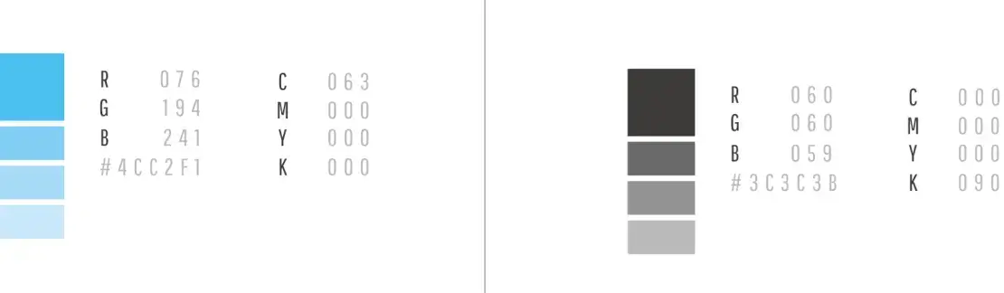
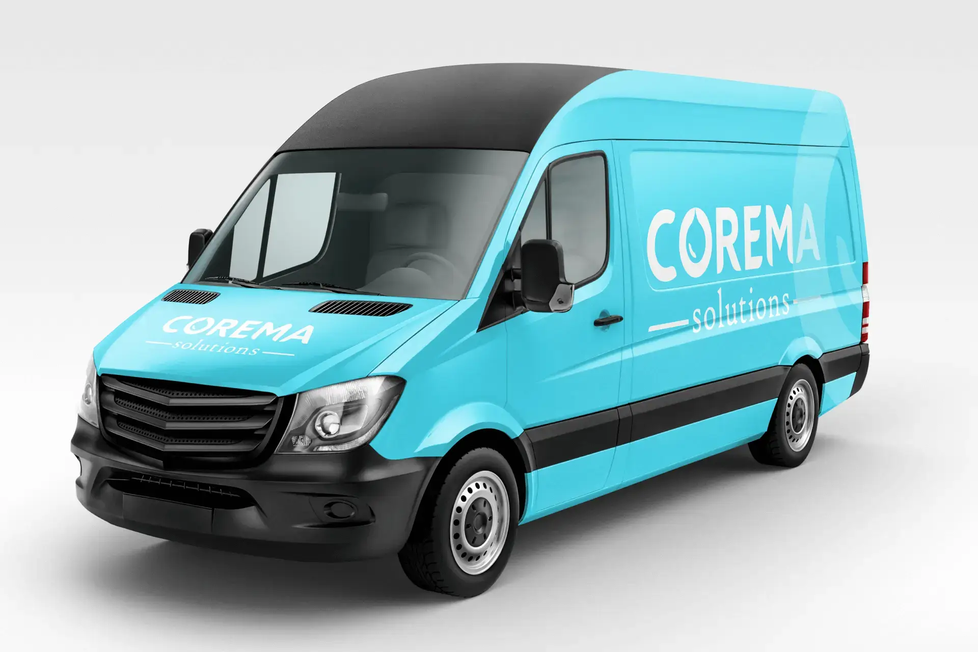
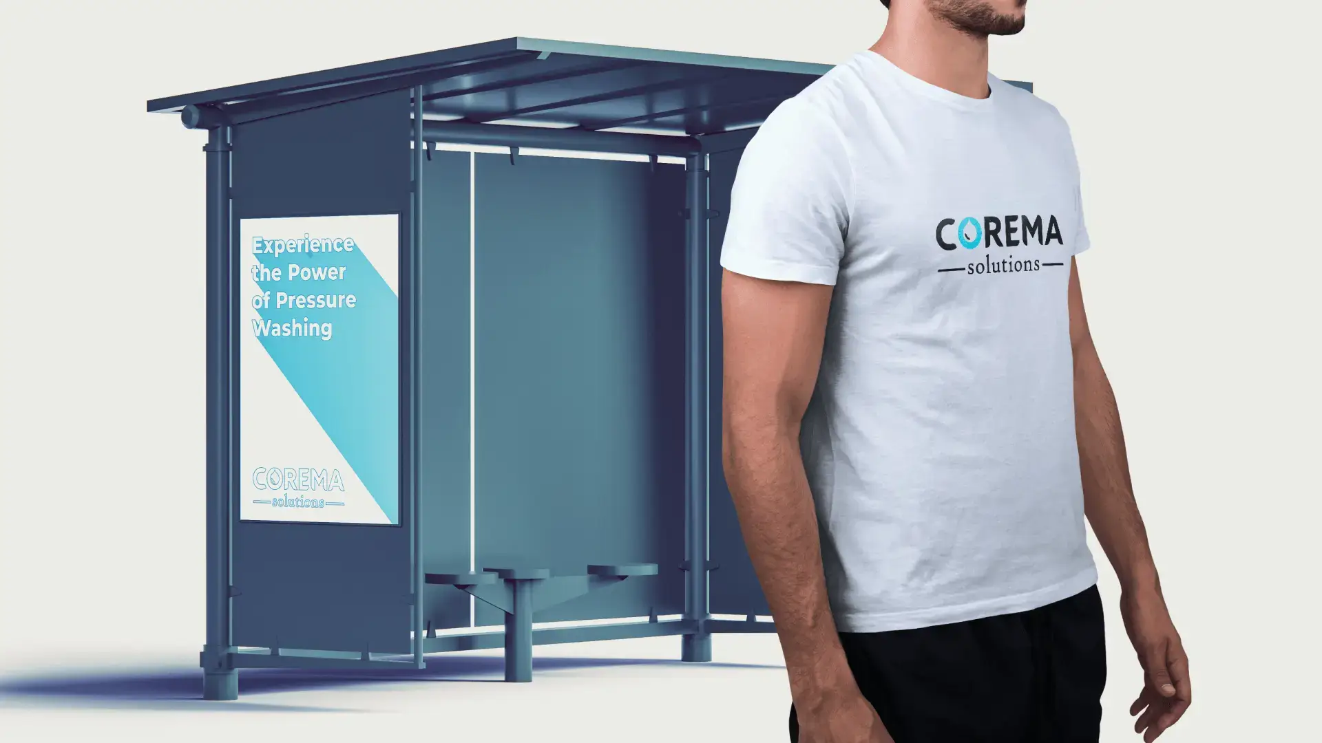
Stability and reliability through color.

We chose a professional and clean color palette for the Corema Solutions logo, with the primary color being bright blue, representing trustworthiness and reliability, and a deep gray that conveys strength and stability. The lighter shades of both colors were used for contrast and balance. The color palette reflects all of Corema Solutions' values and beliefs.
IN DESIGN, COLOR IS NOT JUST A VISUAL ELEMENT, BUT A LANGUAGE OF ITS OWN.
The conclusion

Every ending is a new beginning.

The new logo was well-received by the Corema Solutions team and has helped to better communicate their brand identity to potential customers. The clean, professional design has helped to differentiate the company in a competitive market and has contributed to a more polished and trustworthy image. The new logo has also been well-received by customers, who appreciate the focus on professionalism and responsibility.

Success is the product of determination and hard work.

More of our work

Explore some of our latest projects.
Work with us

Elevate your brand.

Ideas that grow brands.

Want to hear more from us?
Copyright © 2025 Dual Space