Scroll
Case study

Bravo Fitness

Service
Logo design
Role
Visual design

Empowering Fitness Goals: A Case Study of Bravo Fitness

Bravo Fitness is a Dubai-based fitness platform that provides personalized one-on-one training sessions, free consultations, and custom meal and nutrition plans. Their experienced and certified fitness trainers tailor workouts to their clients' fitness levels and goals. They also offer virtual training sessions and conduct fitness events and challenges to encourage clients to achieve their fitness goals. Bravo Fitness believes in a holistic approach towards health and well-being and is committed to providing a positive and empowering environment to their clients.
WHAT WE ENCOUNTERED

Styling hurdles.

Bravo Fitness was a new business with a clear mission, but they lacked a visual identity that could reflect their values and resonate with their target audience. The design challenge was to create a logo that could effectively convey Bravo Fitness's commitment to fitness, experience in the industry, and persistent approach towards their clients' well-being.
Facing challenges can inspire to innovate and grow.
How we do it

The Path to Greatness Starts with the Process.

We were tasked by Bravo Fitness to design a logo that would aptly embody their brand's spirit and effectively convey their mission to motivate and empower clients to attain their fitness objectives. Through a collaborative and iterative approach that involved several rounds of feedback, we worked in close partnership with the Bravo Fitness team to incorporate their vision and preferences, such as their aim to integrate elements of robustness and energy into the design. The end result is a logo that perfectly encapsulates the company's ethos and successfully communicates its fundamental principles to potential clients.
The magic happens when you refuse to give up

Color is the visual representation of energy, and in fitness, energy is everything.

Bringing Bravo Fitness' Values to Life Through Color

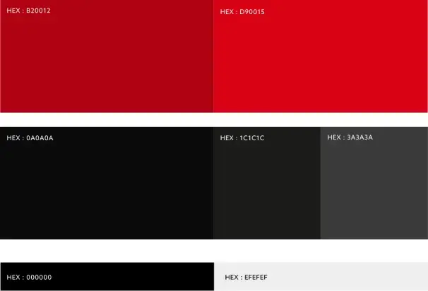
Bravo Fitness has opted for a refined color palette of red and black/gray hues, flawlessly complementing the company's branding. The use of red symbolizes vigor, fervor, and persistence, capturing Bravo Fitness' purpose of kindling and enabling customers to attain their fitness objectives. The black and gray shades create a sense of equilibrium and poise, reflecting the company's unwavering commitment to professionalism and distinction. By artfully integrating these colors into the new logo design, we were able to effectively communicate Bravo Fitness' principles and impart their brand's essence to potential clients.
Color is a force that energizes the mind and motivates the body.
The conclusion

Establishing a Path to Success.

The newly designed logo for Bravo Fitness has stirred up excitement among the team, embodying their brand's identity and principles, and effectively conveying their commitment to inspire and empower their clients. The professional and polished design has set them apart in a highly competitive industry, contributing to their trustworthy and dependable image. Customers have responded positively to the new logo, acknowledging its representation of the brand's core values.
A Look to the Future.

More of our work

Explore some of our latest projects.
Work with us

Elevate your brand.

Ideas that grow brands.

Want to hear more from us?
Copyright © 2025 Dual Space